For those needing a refresher on what exactly the Efficient Frontier is… see below in Part 1. For those in the know who just want to see what the curve looks like now… skip to Part 2.
1. What is It?
The Efficient Frontier sounds like something out of Star Trek, but it is actually an investment/asset allocation concept put forth by those who believe in Modern Portfolio Theory. The general idea is that components of a portfolio should be selected based on what they do to the portfolio’s overall risk and reward profile, not on their own merits. Taken further, one can calculate the best possible mix of portfolio components to arrive at the highest possible return with the lowest possible risk (in terms of volatility or standard deviation of returns). That intersection of the best possible return with the lowest risk is the ‘Efficient Frontier’ point, while the entire graph of various return and risk levels at varying asset allocation amounts can also be called the Efficient Frontier, or Efficient Frontier graph.
Here’s the Efficient Frontier as the CME used to include in its educational materials detailing managed futures, as of 02/2008:
 Source: CME
This showed us that adding a 20% allocation to managed futures increased returns, while decreasing risk (as measured by the volatility of returns). Wow…more returns with less risk, where do I sign up? The same exercise can be done on any mixture of assets – plotting the compound annual rate of return on the y axis (the vertical one) and the annualized volatility of the investment on the x axis (the horizontal one). That may bring back nightmares of calculus curves to some, but the game is simple: get as high as you can, and as far left as you can – on the graph.
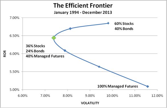
2. How’s it look lately?
Ok, so we get the concept – now just what has the efficient frontier been telling us about asset allocation lately? We mapped out the curve on an updated set of data including the past 3 years, and the results were a little surprising. You’ll see the typical portfolio (50/50 in the CME’s old chart, 60/40 stocks/bonds in our table below) completely switched sides of the graph – going from the lowest return/medium risk portfolio to the highest return/medium risk portfolio combination; while having 100% of the portfolio in managed futures went from being the highest return/highest risk to the lowest return/highest risk (not the profile you want exactly).
 (Disclaimer: Past performance is not necessarily indicative of future results)
Data Stocks = S&P 500, Bonds = S&P/Citigroup International Treasury Bond Index EX-U.S Index,
Managed Futures = Dow Jones Credit Suisse Managed Futures Index
This is a direct result of the poor five year period managed futures have just gone through (with most CTA indices down slightly over that period and the compound return of managed futures over the period fell from about 6.5% to about 5%) paired with the great period stocks have had the past two years (lifting its compound annual return from 7.3% to 8.5%); and just goes to show that any such work in seeing what the optimum portfolio mix was is just that – a look backwards.
But here is another twist to the story… despite managed futures having shed some numbers in the return department, a 40% allocation to managed futures still results in the optimum portfolio mix (with 36% stocks and 24% bonds). We might have expected managed futures to lose its spot as the efficient frontier poster child after this tough 5 year period, but there is remains – firmly in place on the upper left hand of the curve.
How does it stay relevant in the risk/return conversation after its return side has struggled recently. It’s when the volatility happens, not just if it happens. And in managed futures case, the non correlation means the volatility of the managed futures part of the portfolio happens at different times than that in the stock and bond portfolio (except last month, see here).
Finally – we should note that the efficient frontier as it is usually trotted out – as return over volatility of returns – suffers from the same problems the Sharpe ratio does, in that it treats risk as the volatility of returns only. There is a lot more to risk than just the volatility of returns (downside volatility and drawdown to name two…), which led us to ‘rethink the efficient frontier’ in an old 2010 whitepaper. If we get around to it… we’ll update those various efficient frontiers here sometime soon.