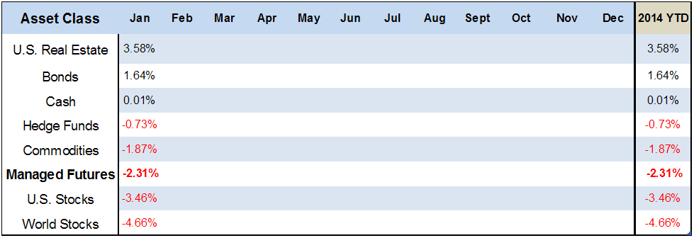
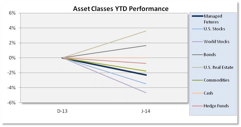
It’s a new year and new returns for our asset class scoreboard, where the investment classes returns are put to the test to see how they do from the beginning to the end of each year. It seems as though the “Bulls” in the final 2013 scoreboard, have warped into the dogs of January, and vice versa.
 (Disclaimer: past performance is not necessarily indicative of future results)
(Disclaimer: For source data look at chart below)
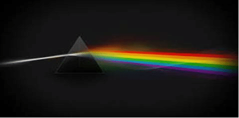
Maybe it’s just the die-hard Pink Floyd fans that we are, but we can’t help but think that January’s chart looks a little bit like the Dark Side of the Moon cover…
 (Disclaimer: past performance is not necessarily indicative of future results.)
Source: All ETF performance data from Morningstar.com
Sources: Managed Futures = Newedge CTA Index, Cash = 13 week T-Bill rate,
Bonds = Vanguard Total Bond Market ETF (BND),
Hedge Funds= IQ Hedge Multi-Strategy Tracker ETF (QAI)
Commodities = iShares GSCI ETF (GSG); Real Estate = iShares DJ Real Estate ETF (IYR);
World Stocks = iShares MSCI ACWI ex US Index Fund ETF (ACWX);
US Stocks = SPDR S&P 500 ETF (SPY)
There’s something about the Dark Side of the Moon album cover that resonates with us as finance nerds… as strange as it sounds. You see, just as the prism releases its rainbow colors (investments) into existence… those colors (investments) are on a never ending trajectory. Lights never have a stopping point, and neither do investments (unless of course they shut down). For the sake of this chart, it’s as if there’s a new color prism at the start of each year. Each investment class gets a clean slate no matter if posting a +30% or -7% returns the year prior. The phrase “past performance is not necessarily indicative of future results” couldn’t be more appropriate.
The problem is it doesn’t work that way. Investors are very aware that Stocks posted a +30% return in 2013, despite its most recent monthly negative performance; just like investors are aware of Managed futures recent struggle, despite the fact that past performance is in fact not necessarily indicative of future results. But it’s not uncommon for one years Bulls to quickly turn into the Dogs of the next. Stocks and World Stocks went from the top two investments, to the bottom two, with Bonds showing the first sign of life in quite some time {past performance is not necessarily indicative of future results}. You’re probably thinking, that’s the whole point of asset allocation, right (sarcasm)? Pick the best or worst performers of the year prior )even more sarcasm)? That’s why the finance community emphasizes so much attention on yearly returns right? Not Quite.
This is a very near sided view. It’s about where the light (investment) was 20-30 years ago, and where it will be 20-30 years from now. Filing down returns to just 12 months can greatly modify how well an asset class is really performing. Adjusting an asset classes yearly returns by just a couple of days could greatly alter where these investments would finish on the scoreboard. Imagine how it would look if you alter it by 6 months?
P.S. — We’ve heard some people question why Managed Futures isn’t showing crisis period performance with Stocks experiencing volatility. The simple answer is negative correlation does not equal non-correlation, and we provide a deeper explanation here.