Unlike the thousands upon thousands of potential investors whom forced themselves to click on the “Scary Parallel” chart overlaying the 1929 & current Dow Jones Industrial Average, the concept seems like fear mucking propaganda produced to push people out of the market. Reformed Broker said it best last week with a post titled “The Chart that won’t Die,” explaining why such a chart is illogical and flawed.
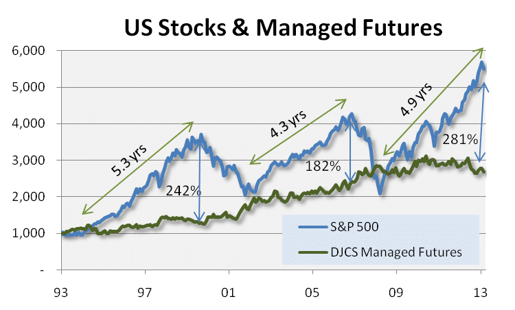
What we won’t ignore is the stock markets unprecedented stretch to all time highs this week. But while everyone else is evaluating the valuations of the stock market itself, we’re looking at things a bit differently – and analyzing how far the thing needing diversification from (stocks) has out run the diversifier (alternatives)… We’re interested in analyzing how the S&P 500 is performing relative to managed futures.
Now, this is somewhat of a strange comparison – as managed futures as a whole is non-correlated to the S&P, meaning we shouldn’t expect managed futures to be running up to new highs right alongside S&P; but how far the non crisis period investment runs ahead of the crisis period investment is a bit telling in our opinion – especially when looked at over the past 20 years where three distinct cycles appear.
 (Disclaimer: Past performance is not necessarily indicative of future results.
The graph above depicts the total return of each asset class since 1993, with the listed ‘amounts’ the difference between such total returns as of the dates listed.)
We’re well into the third cycle of the past 20 years now – and the amount of over-performance of the S&P 500 over managed futures has set a new record, surpassing the old record back in August 2000, to stand at 281% (that’s the difference between the total returns since January 1993, with stocks currently standing at +449% and managed futures at +167%).
The million dollar question is whether this outperformance will last, or whether we’ll see stocks come down to managed futures and managed futures come up to stocks as they did in 2001/2002 and 2007/2008 {past performance is not necessarily indicative of future results}. We can see that stocks overshot the downside a bit, actually falling below managed futures total return a short 5 years ago, and maybe that means they’ll overshoot on the top side as well.
We half-jokingly said to sell everything else and buy stocks in a newsletter back in late 2012 (and we actually should have – with stocks up 46.7% since then), and this move to new all time highs (again) feels a lot like that period where things are getting a bit stretched and a reversion to the mean is overdue. The cool thing is – that doesn’t necessarily mean a sell off for stocks (although that is definitely on the table as we saw at the beginning of February); a contraction in the outperformance of stocks over managed futures could just as easily be managed futures going up more than stocks for a while, as it could be managed futures going up while stocks go down as has happened in the past crisis periods.
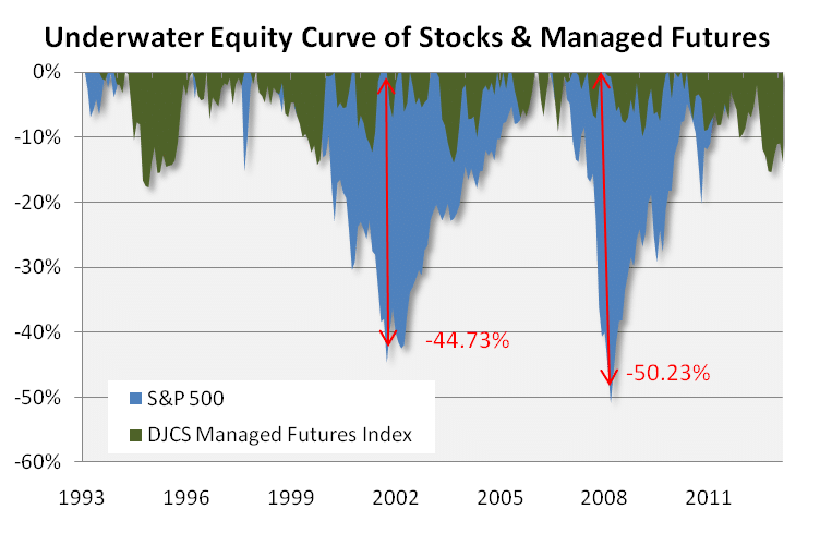
We would be remiss if we didn’t mention the total return comparison above ignores risk… A switch to an ‘underwater equity curve’ which shows the amount of loss each asset class experiences before going back into positive territory; highlights how that big outperformance comes with much, much higher risk in terms of the max amount of pain investors must endure.
 (Disclaimer: Past performance is not necessarily indicative of future results)