A little more than a week has gone by, and we haven’t heard anyone discuss Bloomberg’s shift in the presentation of their charts/graphics (Here and here are just two examples). We’re not sure if we like or really hate these new Bloomberg graphics, but what is going on – is there a demand for this? What do you think?
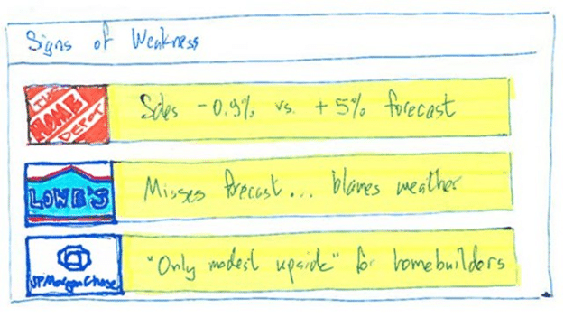
 (Disclaimer: past performance is not necessarily indicative of future results)
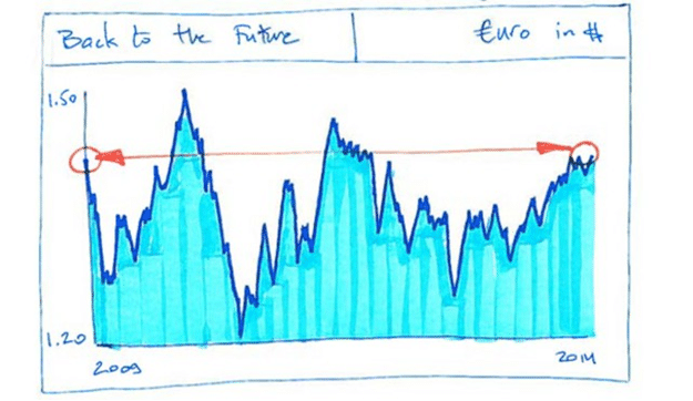
Charts Courtesy: Bloomberg
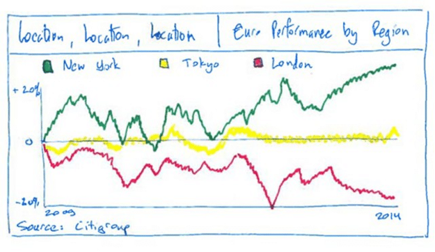 (Disclaimer: past performance is not necessarily indicative of future results)
Charts Courtesy: Bloomberg